
Can you think back to a time when you had to make a decision on a brand to choose for a certain product? If you had little information on the differences between the brands, what influenced your choice?
If you’re like most people, it likely had a lot to do with the way it looked — specifically its colors. From the packaging to the logo, the colors chosen to represent a brand make a huge impact on the way an audience will perceive a brand. Think of it as a nonverbal statement on a brand’s identity, personality, and target consumer base. This is why colors should not be chosen at random when branding a product, because they actually play an integral part in shaping the brand, and directly impact sales output. As a digital agency we have experience in brand development across a variety of industries. Using this experience we have put together a basic guide to help in choosing colors to best represent your brand.
If you are in the process of choosing a design, making a logo, designing a website, or determining product packaging for your business, then this is a must-read guide to determining your business brand colors.
The Importance of Your Business Brand Colors
One reason colors are so important for your brand is because of brand recognition. It’s important your brand stands out and people recognize it immediately, and it’s ideal if consumers can identify the brand or product just by the design and/or colors, without seeing the name. Think about it: you don’t have to see the “Starbucks” symbol on a latte cup to know where it’s from; you can identify it simply by the dark green straw. If you choose a unique, identifiable color or color combination and use it consistently your consumers will be able to distinguish your brand from your competitors. When customers become aware of your brand and recognize it instantly it helps create brand loyalty. People gravitate toward things they are familiar with, so simply being a recognizable brand will form an intrinsic connection between your consumers and your product.
Color also provides a unique opportunity to subconsciously elicit different emotions and sensations in people. They have a huge impact on what consumers associate with your brand. A color sends non-verbal message, and choosing the right colors is crucial to making sure that message persuades consumers in the direction you desire. Colors can communicate who you are as a business, and determine how your audience will bond, or not bond, with your brand. In fact, studies show that colors influence 60-80% of a consumer’s purchasing decisions (Risk-Return Analysis, Markowitz). Because business brand colors play such a huge role in consumers’ buying trends, understanding what different colors represent and the emotions they provoke will help you predict how your market will respond to each one. Don’t go into choosing your business brand colors blindly. Read this guide to become a color expert, and optimize your opportunity to persuade consumers on every level that your brand is the one for them.
Color Associations in Your Business Brand Colors
Because colors have such an impact on consumer psychology, different colors work best for different industries and types of products. Below, we have outlined several different colors, the benefits and disadvantages of each, and examples of which industries we believe they work best with.
Business Brand Colors: Blue

Blue is the most popular color for companies, with 33% of brands using it in their logos. It is calm, professional and dependable. Blue elicits a serious yet confident vibe, and establishes a sense of responsibility. No wonder it’s used so frequently by IT, technology, equipment and finance brands. Use blue in your brand color if your business’s focus is connection, information or communication.
On the downside, blue is relaxing and serious, so avoid using too much of it if you want your brand to bring out an exciting and fun mood, such as fashion, food, music or event planning brands.
Business Brand Colors: Red
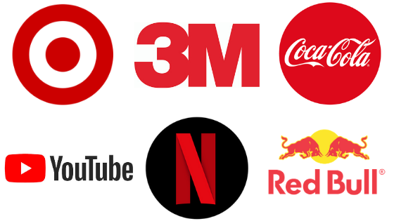
Red is a close second to blue in brand color popularity. It is associated with strength, excitement and passion. The color evokes strong emotions in people and encourages them to take action, which can often trigger impulsive shopping. It is bold and attention-grabbing, which is why it’s often used by brands in the marketing and entertainment industries, such as Netflix and YouTube. It’s also great for fast food and energy drinks, as it encourages immediate activity.
Be careful, however, as this heart-rate increasing color can backfire if used incorrectly. In the wrong contexts, red can trigger aggression and stress, and cause visual fatigue due to its intensity. Avoid this color with brands like beauty products, home decor, boutiques, or anything sleep or relaxation-related.
Business Brand Colors: Grey
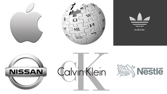
Another common color group used in brand design and logos is neutral and gray tones. Gray, like blue, is professional, serious and credible. However, it is more conservative, and can come across as dignified and timeless if used correctly. This is why it’s perfect for classic, industry-leading brands like Apple, Adidas and Calvin Klein. It also works well for information-related companies like Wikipedia, as it evokes a sense of reliability and trust.
Gray and neutral colors are great for information, technology, and equipment brands. Again, avoid these if your company is in the entertainment, beauty, or food industries, as gray would be too dull for these more flamboyant markets.
Business Brand Colors: Black and White
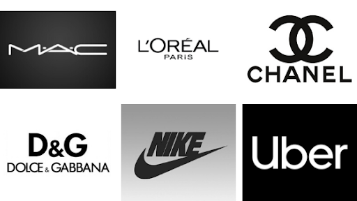
Don’t forget that another viable choice for brand color is, well, no color! Similar to gray, black and white logos make a product look classy, but they add an extra level of elegance and sophistication. They are also great for portraying luxury and prestige, as seen in the MAC and Dolce & Gabbana logos. We recommend black and white for brands wishing to portray simplicity and power. It is great for luxury, fashion and accessory brands, and can also work for IT and equipment companies.
The downside of black and white brand colors is that they have the potential to be too intense and serious, and can even come across as depressing and unwelcoming if used in the wrong industry. We suggest avoiding this combo if your brand is in the industry of family products, nature, children or animals, as well as retail or fast food.
Business Brand Colors: Yellow
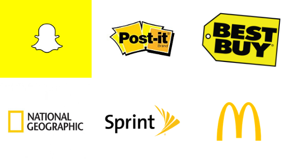
Are you looking for a color that invokes feelings of warmth, lightheartedness and optimism? We’ve got just the color for you! Yellow is attention-grabbing yet comforting. Fun, vibrant, inclusive and inviting, yellow is a great choice for brands like Snapchat, Post-it and McDonalds.
The disadvantage of yellow is that it can make luxury, finance, and information-related brands look like they are not serious enough. It doesn’t bode well for elegance or prestige. However, yellow is great for family and children related brands, entertainment, and social communication (when used moderately as we see in the Sprint logo).
Business Brand Colors: Gold
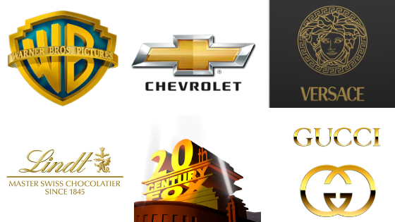
Yellow’s more mature counterpart, gold has a similar vibrance and warmth, but incorporates an element of prestige. Consumers view gold in brand colors as superior and expensive. It’s great for luxury brands like Gucci and Versace, and works for leading entertainment companies like Warner Brothers and 20th Century Fox.
Be careful though–too much gold can come across as pretentious depending on your market, as it may be associated with greed and elitism. We suggest avoiding gold with any social communication, healthcare or family brands.
Business Brand Colors: Green
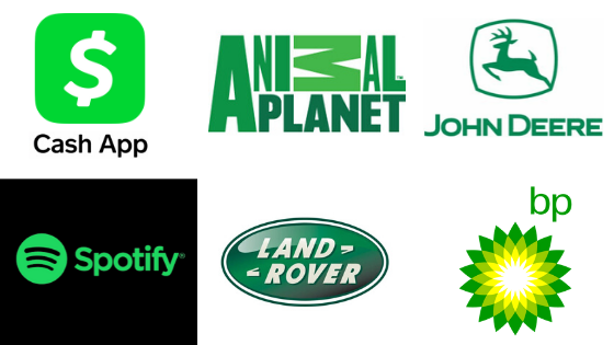
Considering green for your brand color? Great! Green is the color that is easiest on the human eye, and it has two main associations: nature and money. Green is great for brands like Land Rover, John Deere and BP, who are environment-related. Since green is associated with peace and relaxation, it’s also great for music brands like Spotify.
The downside? It can be a little too peaceful. Since it is such a safe and relaxing color, it can often be too dull for marketing, as it doesn’t encourage people to take action or act impulsively as other colors do.
On the other hand, since green is associated with cash in America, it can work very effectively for money-related brands like Cash App), and can evoke a desire for wealth in consumers, which is great for investment brands.
We suggest using green in industries related to agriculture, nature, outdoors, leisure activities and finance. Avoid using it with luxury products, as well as IT, fashion and travel brands.
Business Brand Colors: Orange
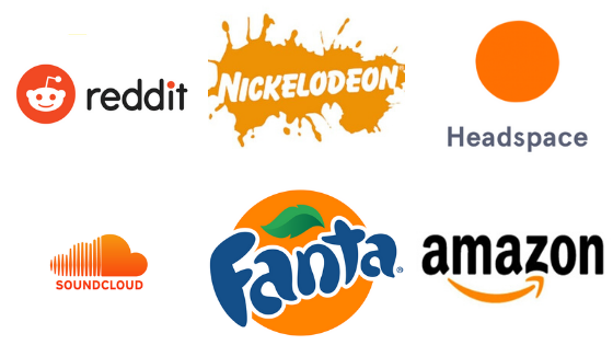
Similar to yellow, orange evokes a sense of energy, fun and enthusiasm, but with more sensuality and comfort. Orange is a call-to-action color. It’s great for entertainment and youthful brands like Nickelodeon, Reddit, Soundcloud, and Fanta. It also works with energy products and family brands.
However, because of its intensity, it is the kind of color that is often better in combination with another more neutral color (notice how Amazon only uses a hint of it?). This is because too much orange can be perceived as juvenile by older audiences. We’d suggest avoiding too much orange with technology, finance, or transportation brands.
Business Brand Colors: Purple
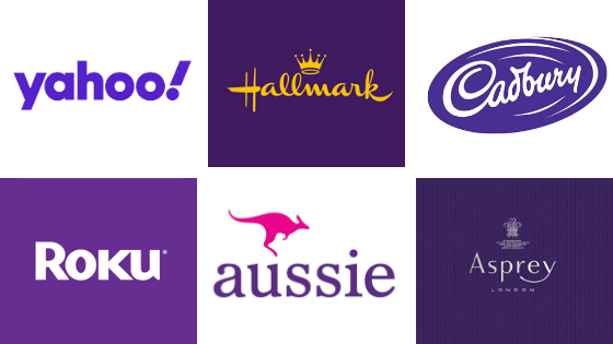
Purple elicits a sense of high quality. Especially when used in combination with gold, it can be associated with royalty, sophistication and extravagance, as we see in the Hallmark logo. At the same time, it can also come across as youthful and creative. It offers a balance between fun and sophistication. Purple is great for communication, entertainment, home decor, jewelry, and fashion brands. Avoid using purple with fast food, family, and equipment brands.
Business Brand Colors: Pink
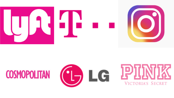
Pink is often associated with femininity, as we see in the PINK and Cosmopolitan logos. It is nurturing, youthful and romantic. However, it is also used in many non-female exclusive brands, like Lyft, T-Mobile, and LG. This is because pink is calming, reassuring, and family-oriented.
Be careful when using pink, as it can also be seen as naive, immature and juvenile when used in the wrong context. Pink is often used in very small amounts to offset these potential downfalls, and it is great in combination with other colors, as seen in the Instagram logo.
Pink goes best with fashion, beauty, family, children’s, leisure, and social communication brands. We suggest avoiding it with finance, agriculture, or IT brands.
Color Combinations in Your Business Brand Colors
Now that you know the psychological associations behind each color, you can begin to mix and match.
However, if you thought picking the color with the right connotation was hard, it gets even more complicated when combining colors, as each color combo has its own associations as well. There are an infinite number of ways you can combine colors, including variating the tones, shades and tints. That’s why at SN Digital Agency, we have a team of experts who specialize in branding and conduct in-depth market research for our businesses to determine the best visual strategy. But for the sake of brevity, we are going to keep it simple and just outline some of the basic color schemes.
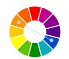
Analogous Color Schemes for Business Brand Colors
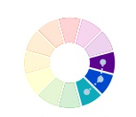
Analog colors are those that are side by side on the color wheel. In terms of branding, they are safe, as close colors go well together inherently. Analogous colors create a welcoming, harmonious feeling for your consumers. They are best used if you want your brand to elicit feelings of trust, security, and connection. Some great industries for these include finance, environment, or family brands. See how it is used in the below examples:
Monochromatic Color Schemes for Business Brand Colors
Monochromatic colors are different shades, tints and tones of the same hue. This is great for showing that your brand is unique, sophisticated and modern. It works well for brands in the communication, technology, and, like analogous colors, the family and environment industries, as we see in the logos below:

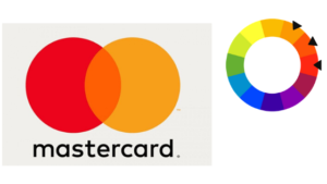
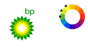
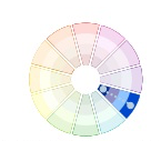
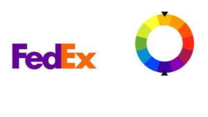
Complementary Color Schemes for Business Brand Colors
 Complimentary colors are those that are opposite from each other on the color wheel. Together, they elicit a dramatic, attention-grabbing and energetic feeling for your brand with their clashing hues. They are great for brands in the entertainment, transportation and food industries.
Additional Tips on Choosing Your Business Brand Colors
Overall, when choosing the color for your brand, simple is often better. We recommend that brands avoid overdoing it, especially if they aren’t working with a digital marketing agency who can help guide your strategy. Once you’ve decided upon your brand colors, remember to stay consistent. This means using the same color scheme across all of your logos, website(s), social media pages, packaging, etc. In our experience, this is the key to cultivating brand awareness. Keep in mind only 50% of brands even use text in their logo; color is the key to brand recognition.
Understanding the psychology of colors in marketing provides tremendous insight into how your audience will react to your product. Whether they are shopping the aisles of a store or browsing your website online, your consumers will unknowingly use the color and design of your brand to determine whether they will make the purchase. Make that decision as easy as possible for them by knowing which colors work best for your brand.
For those wanting to know more about navigating the world of digital marketing and branding for your business, did you know that SN Digital Agency is a full-scale digital and social media marketing agency? We have experience in marketing our clients’ brands and channels, and growing their businesses using the same strategies we shared above, and we have years of expertise behind us. Don’t hesitate to contact us today!
I used to work at NBC.com. We had to be super careful not to mess with the Peacock, lest the “Peacock police” would bring down the hammer. You should add this colorful logo to your insightful analysis. At one point it was the 2nd most recognized brand. Thanks!